WorkClient workProject

NAY Studios

Year
2026
Role
Co-founder & brand designer
  • Branding
  • Brand system
  • Motion graphics

A calm, crafted identity for a digital studio in Amman.

Brief

A new digital studio for small and medium businesses needed a brand that feels quiet and crafted, not loud.

Idea

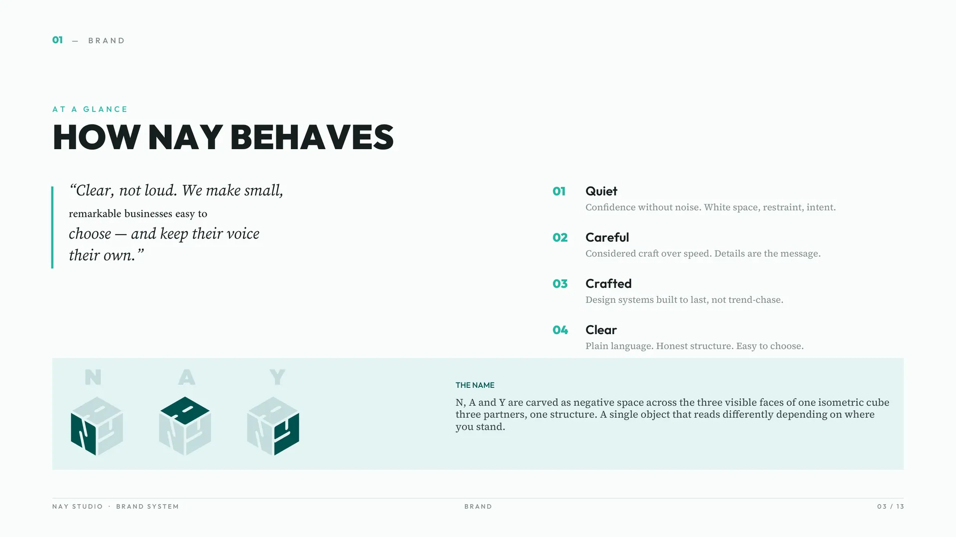
N, A and Y carved as negative space across the three faces of one isometric cube. Three partners, one structure. A single object that reads differently depending on where you stand.
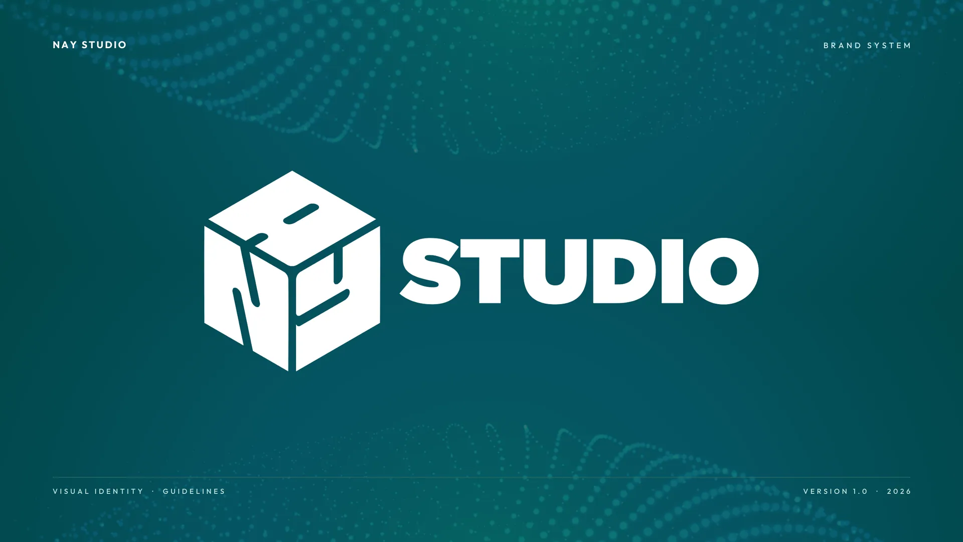
  1. Brand book cover: the NAY cube logo with the word STUDIO in white on deep teal, titled NAY Studio, Brand System.
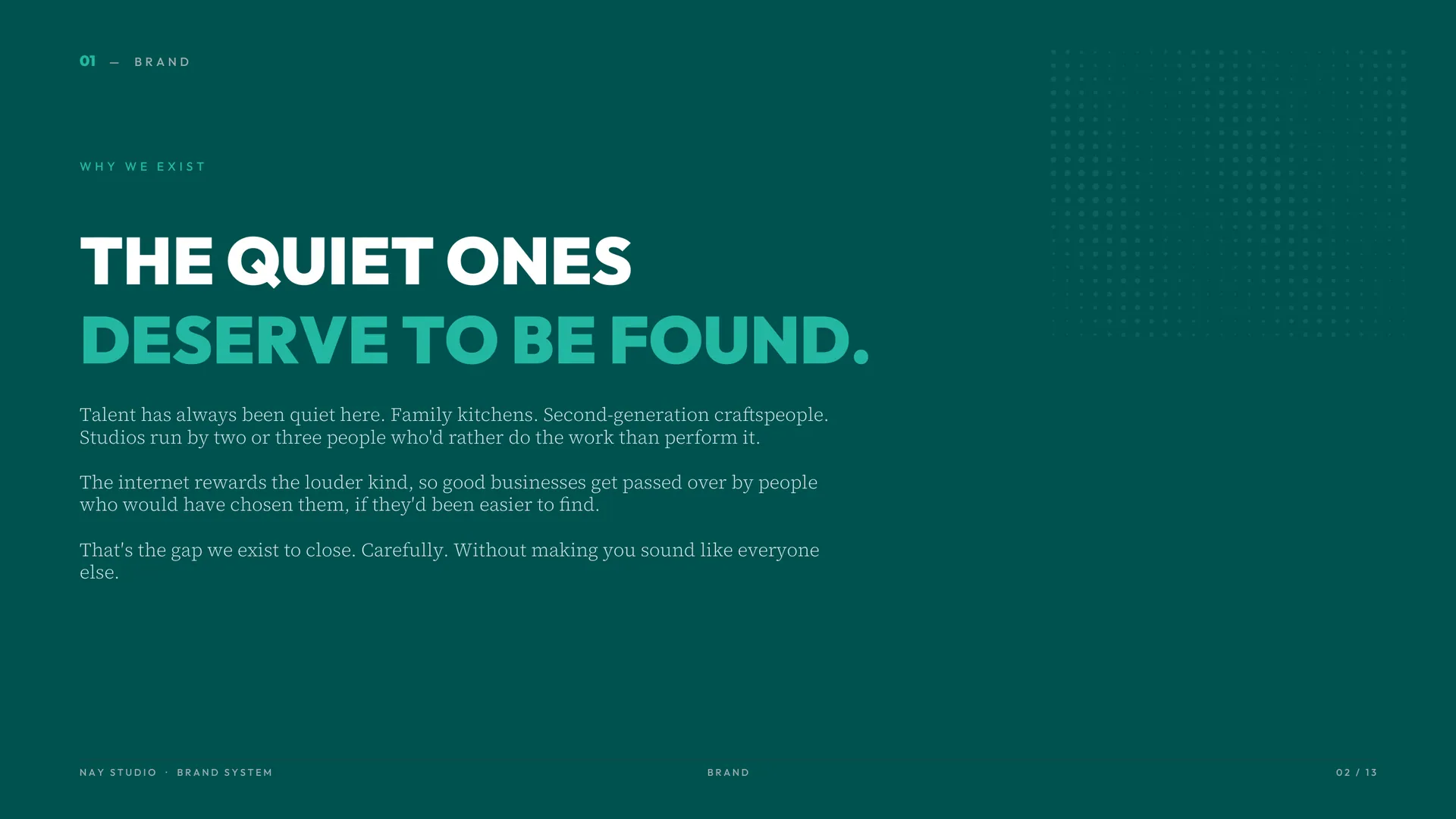
  2. Why we exist: THE QUIET ONES DESERVE TO BE FOUND, in teal and mint on deep teal.
  3. How NAY behaves: four traits, Quiet, Careful, Crafted and Clear, and the name: N, A and Y carved into the faces of one cube.
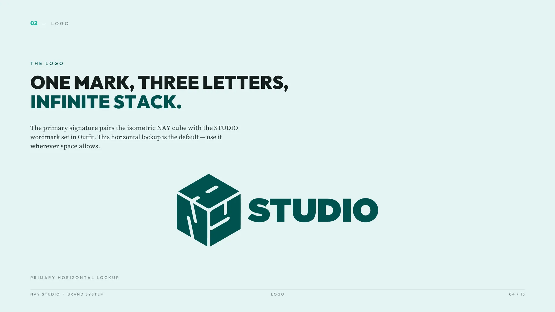
  4. The logo: one mark, three letters, infinite stack. The isometric NAY cube beside the word STUDIO.
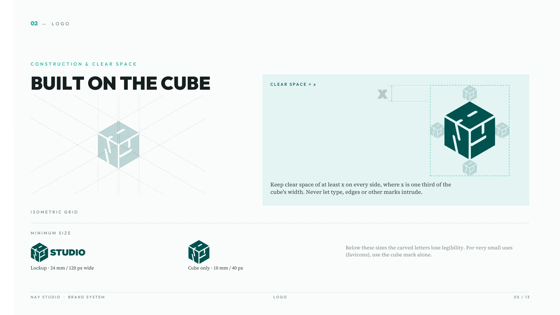
  5. Construction and clear space: the cube drawn on an isometric grid, with the clear space marked around the logo.
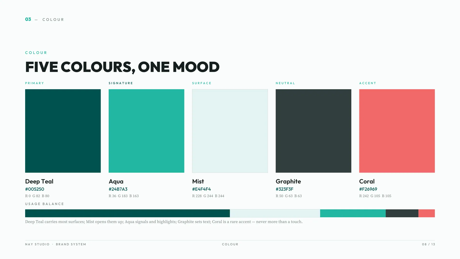
  6. Colour: five colours, one mood. Deep Teal, Aqua, Mist, Graphite and Coral, each with its HEX and RGB values.
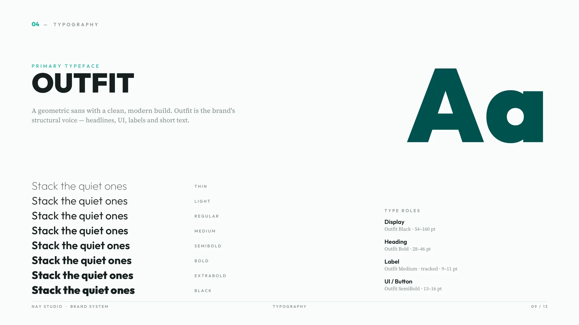
  7. Primary typeface: Outfit, a geometric sans, shown at several weights.
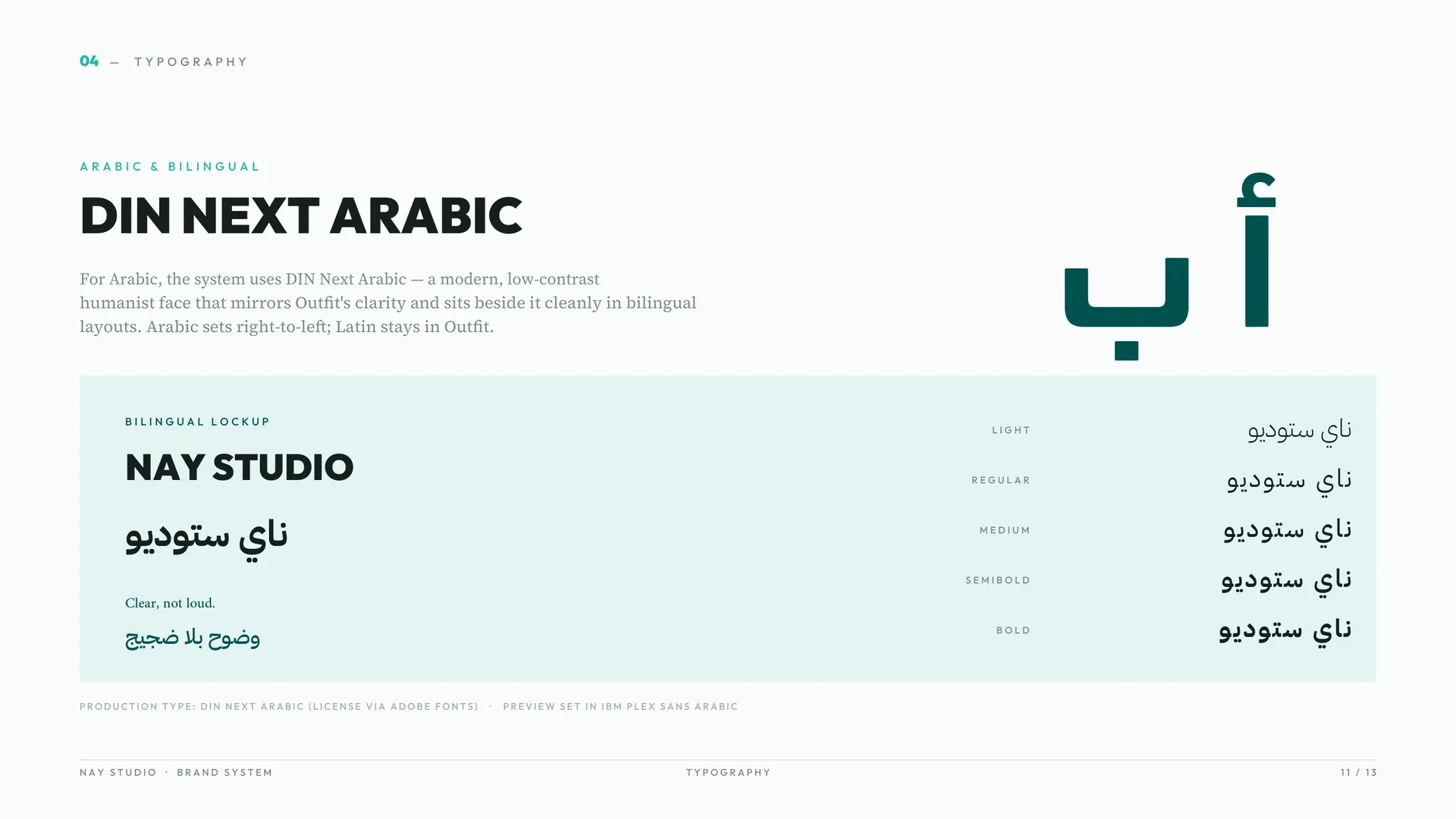
  8. Arabic and bilingual type: DIN Next Arabic beside Outfit, with a bilingual NAY Studio lockup and the line Clear, not loud.
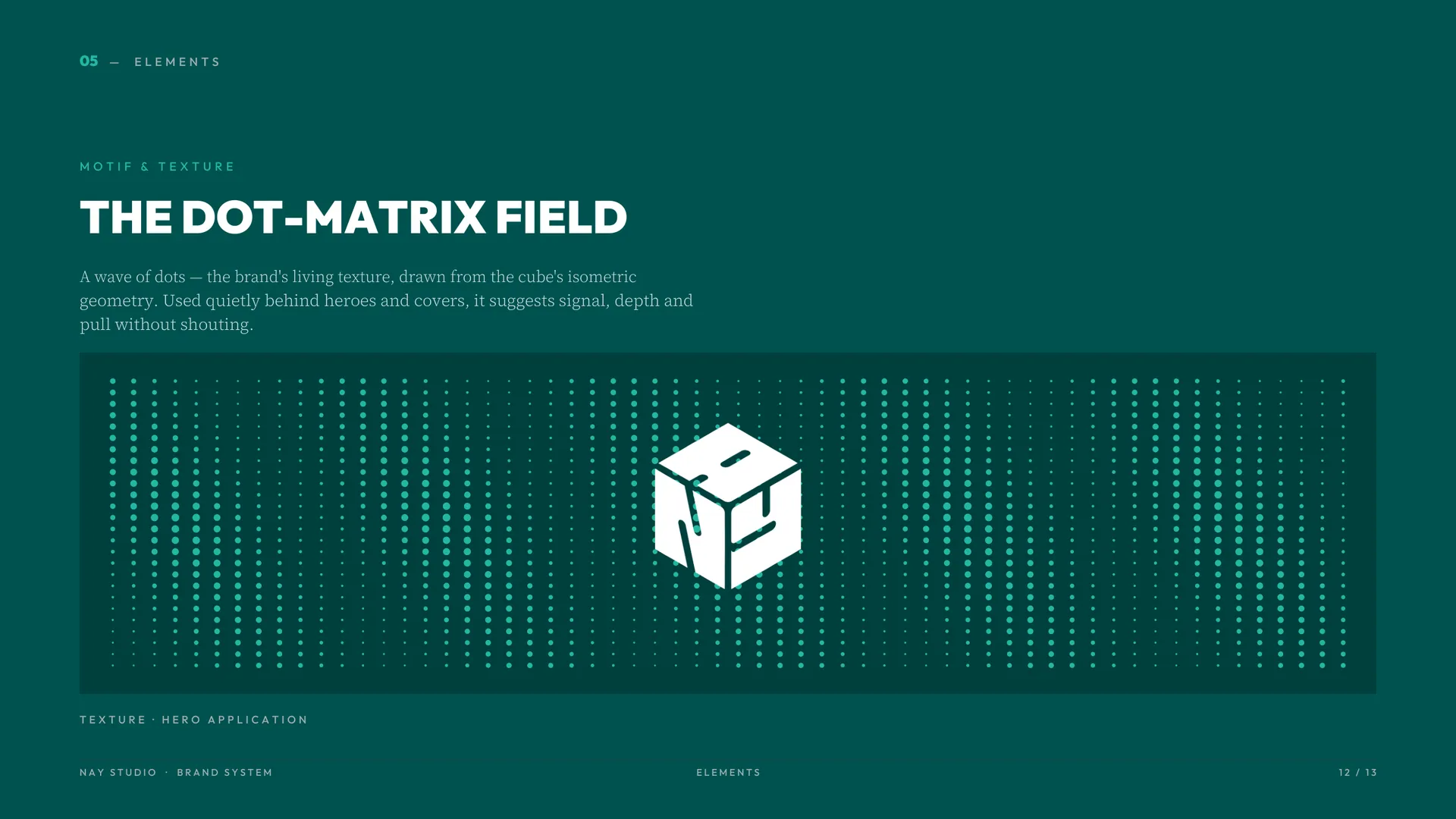
  9. Motif and texture: the dot-matrix field, fine dots radiating behind the cube on deep teal.
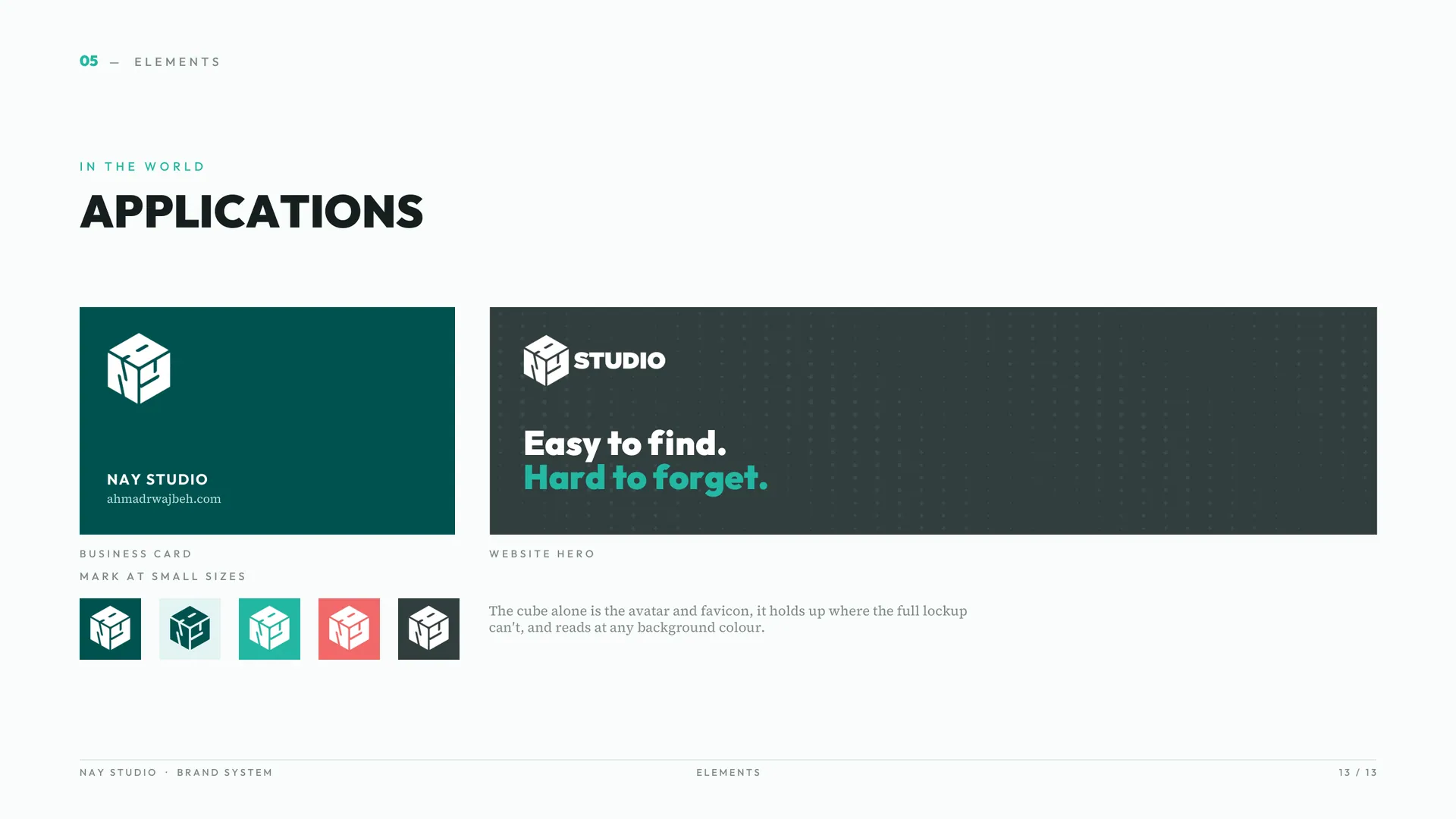
  10. Applications: a business card with the line Easy to find. Hard to forget., a website hero, and the cube alone at small sizes.
  11. See it live → nay-studio.com The studio's website, with the identity in use. (opens in a new tab)

Result

The identity runs across NAY's website and launch content.