WorkClient workProject

Marah

مَراح

  • Branding
  • Graphic design

A café identity drawn from the Jordanian badia — named for the place where travellers rest after the road.
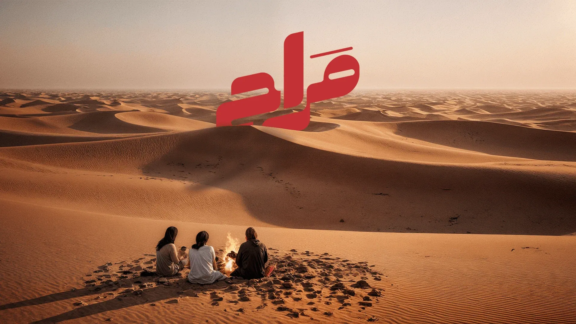
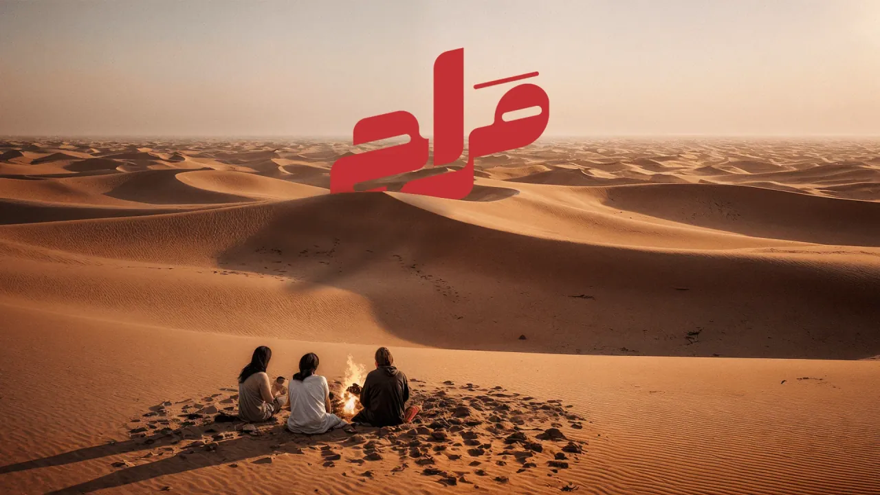
Cover: the red Marah logo over desert dunes, with three people sitting around a fire in the sand.
  1. Cover: the red Marah logo over desert dunes, with three people sitting around a fire in the sand.
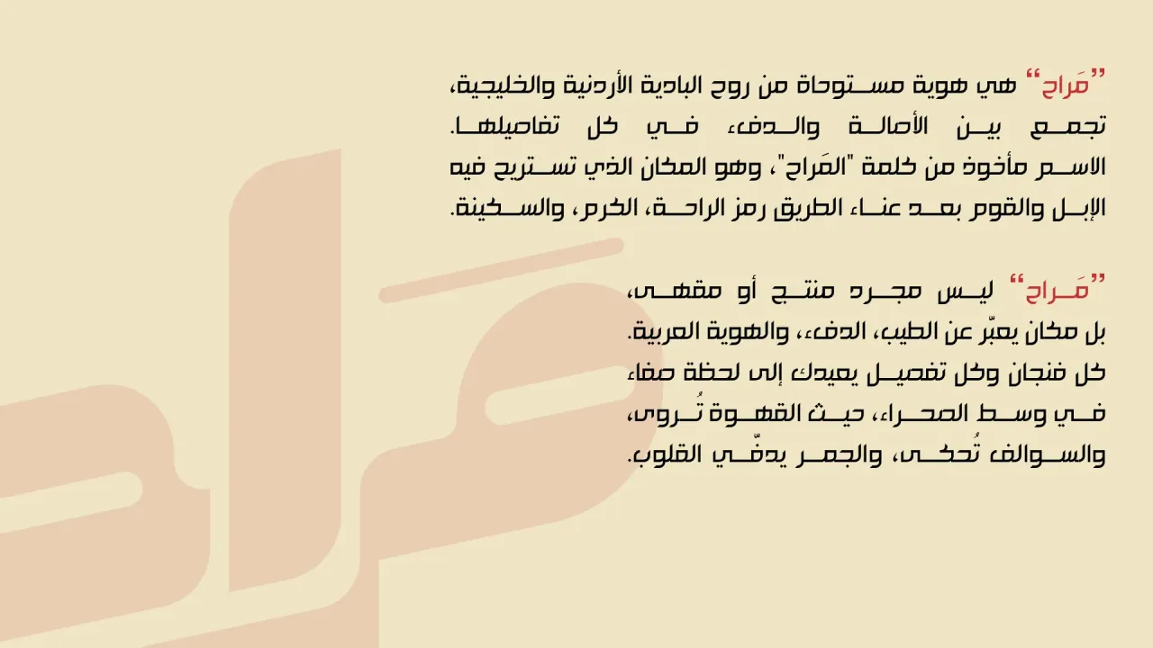
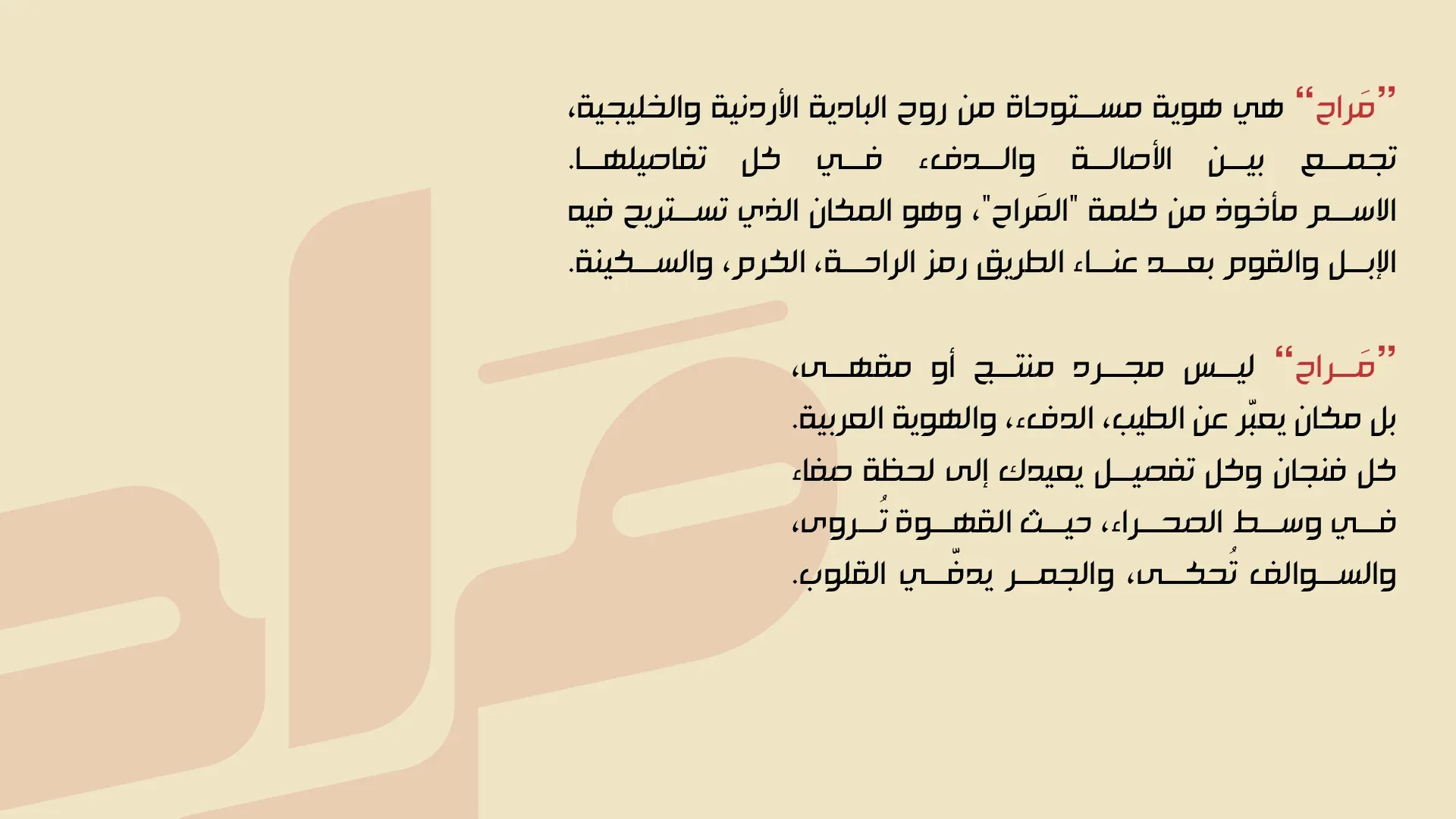
  2. Brand story in Arabic beside a large faded logo.

    Marah is an identity inspired by the spirit of the Jordanian badia, bringing together authenticity and warmth. The name comes from al-marah, the place where camels and people rest after the hardship of the road: a symbol of rest and generosity. Marah is not just a product or a café, but a place that expresses kindness, warmth and Arab identity. (Translated from the Arabic page.)

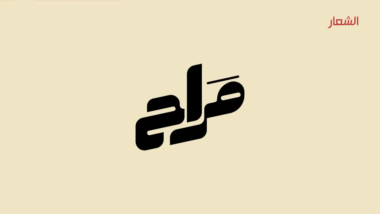
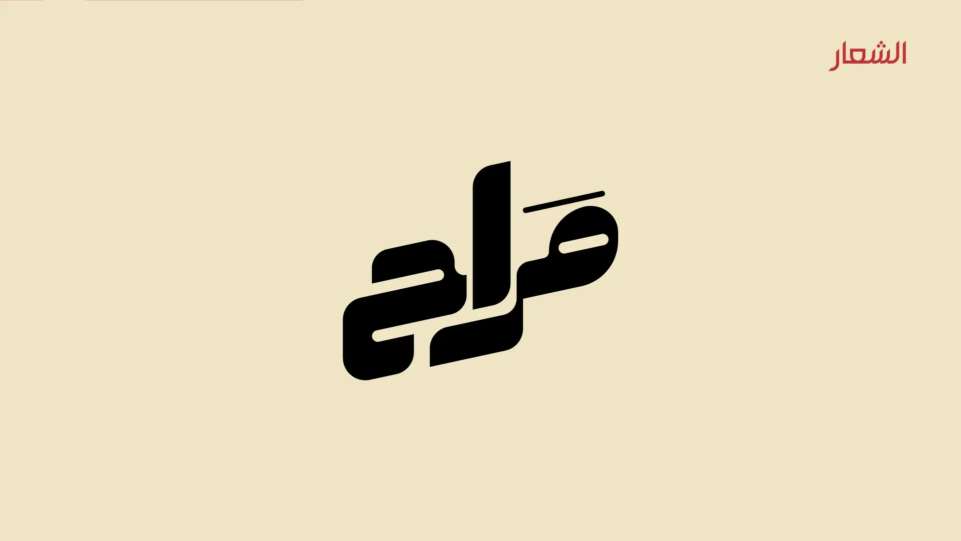
  3. Logo page: the black Arabic Marah wordmark on cream.
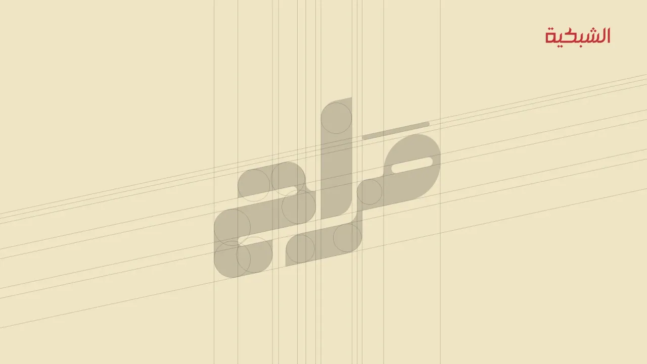
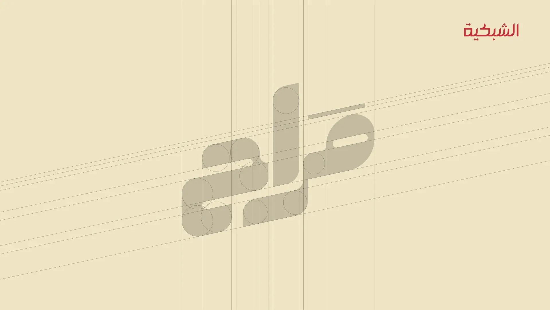
  4. Logo construction grid.
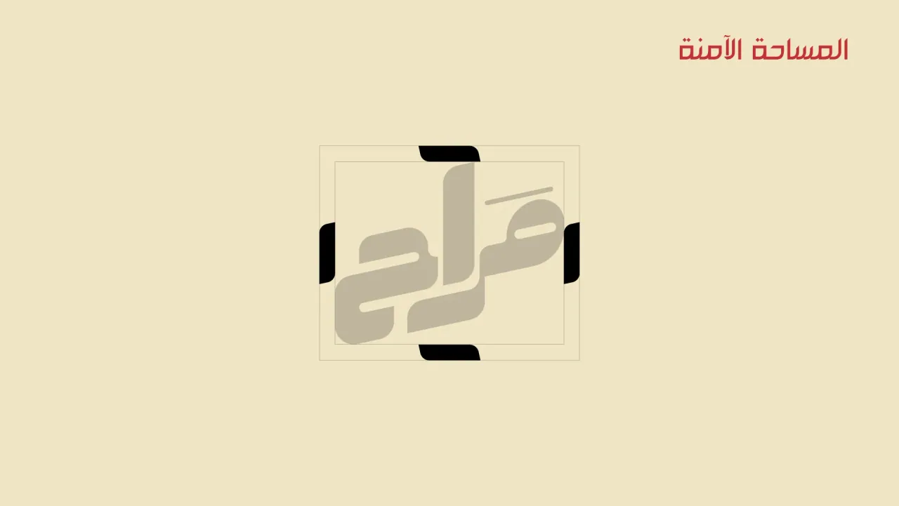
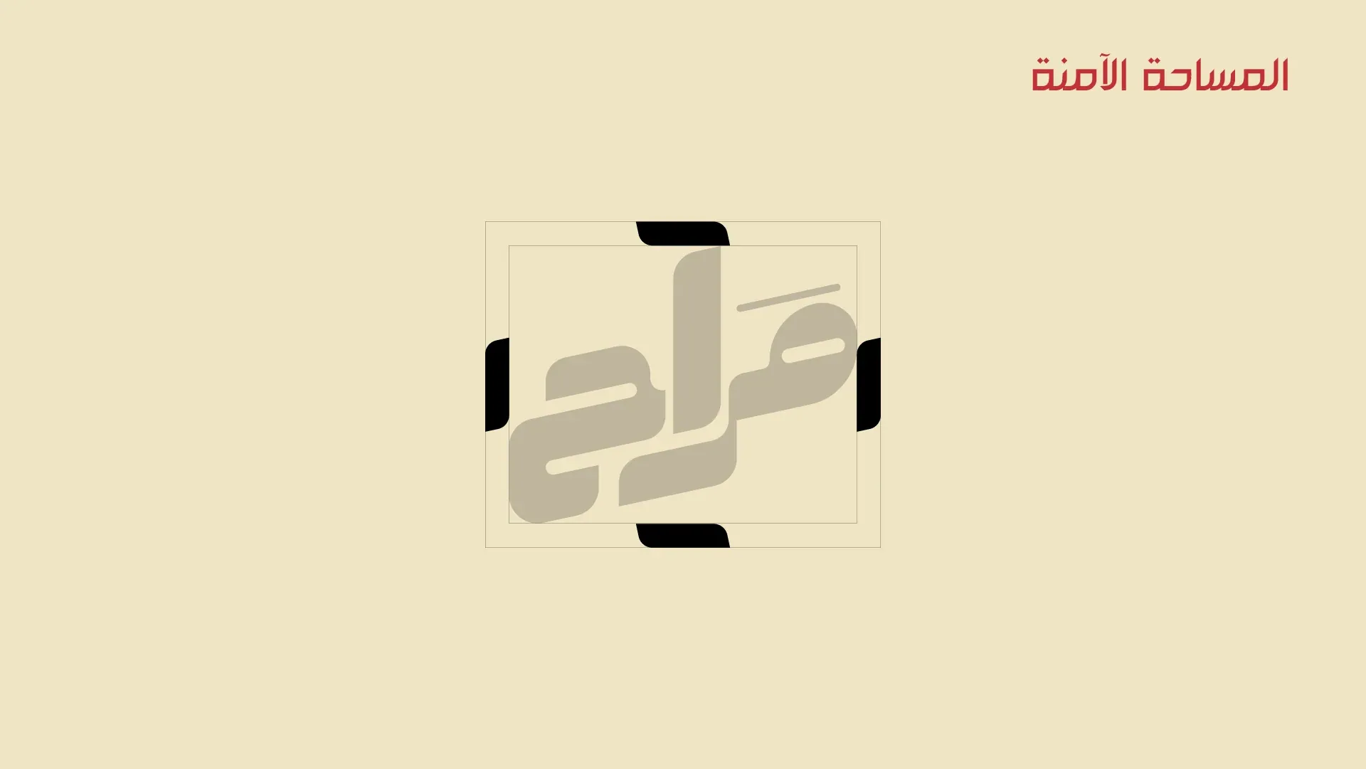
  5. Clear space around the logo.
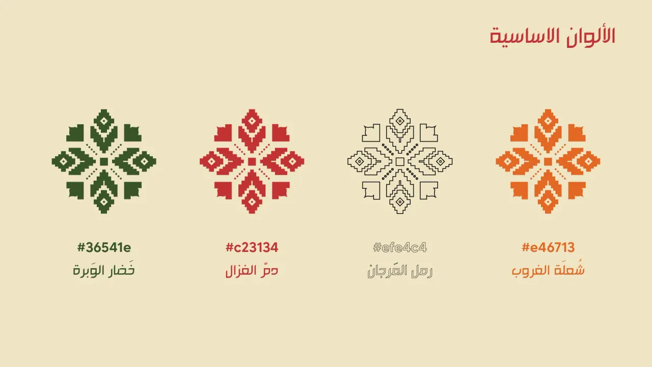
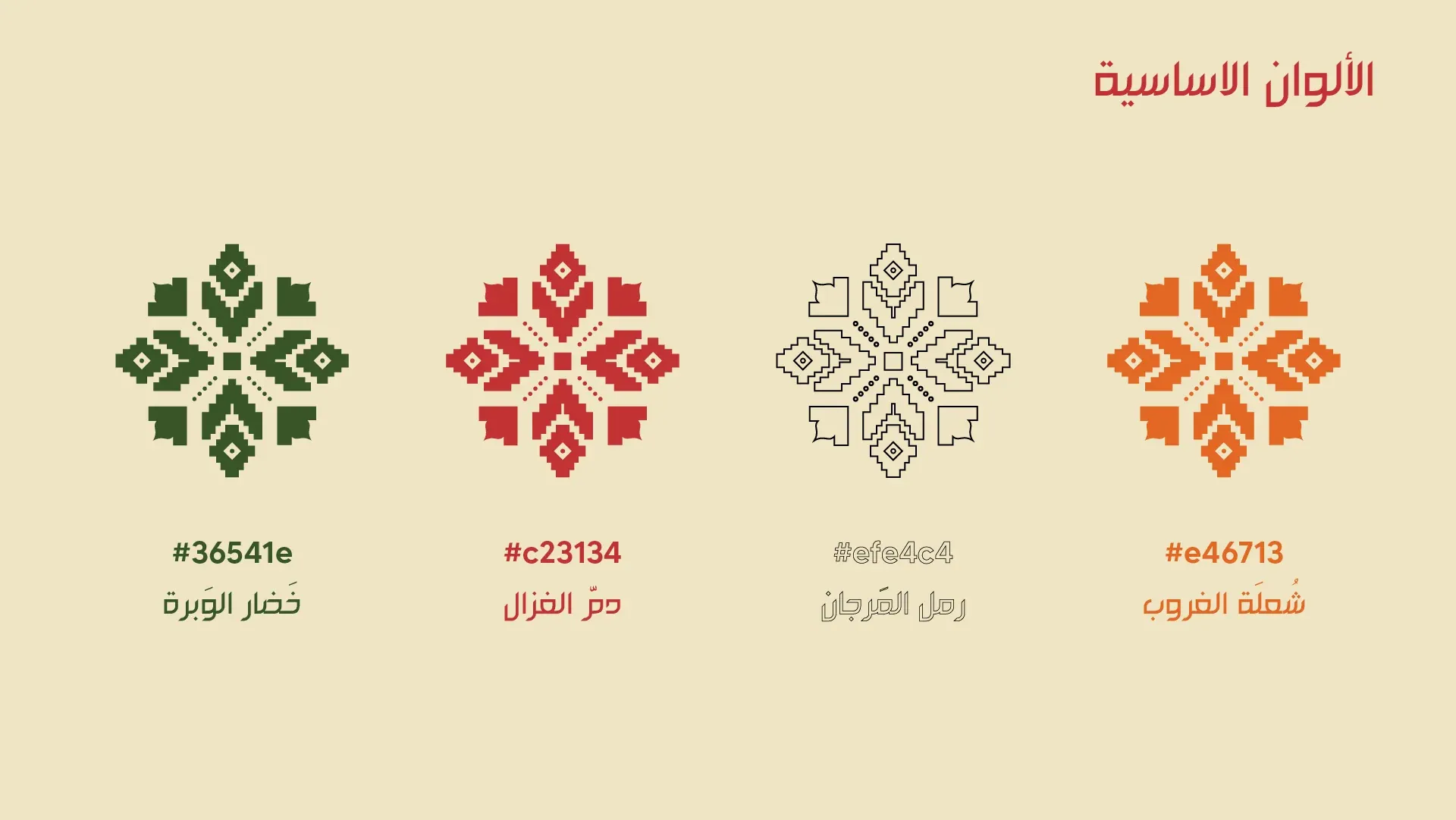
  6. Primary colours: four stitched star motifs in green, red, grey and orange, with colour codes.
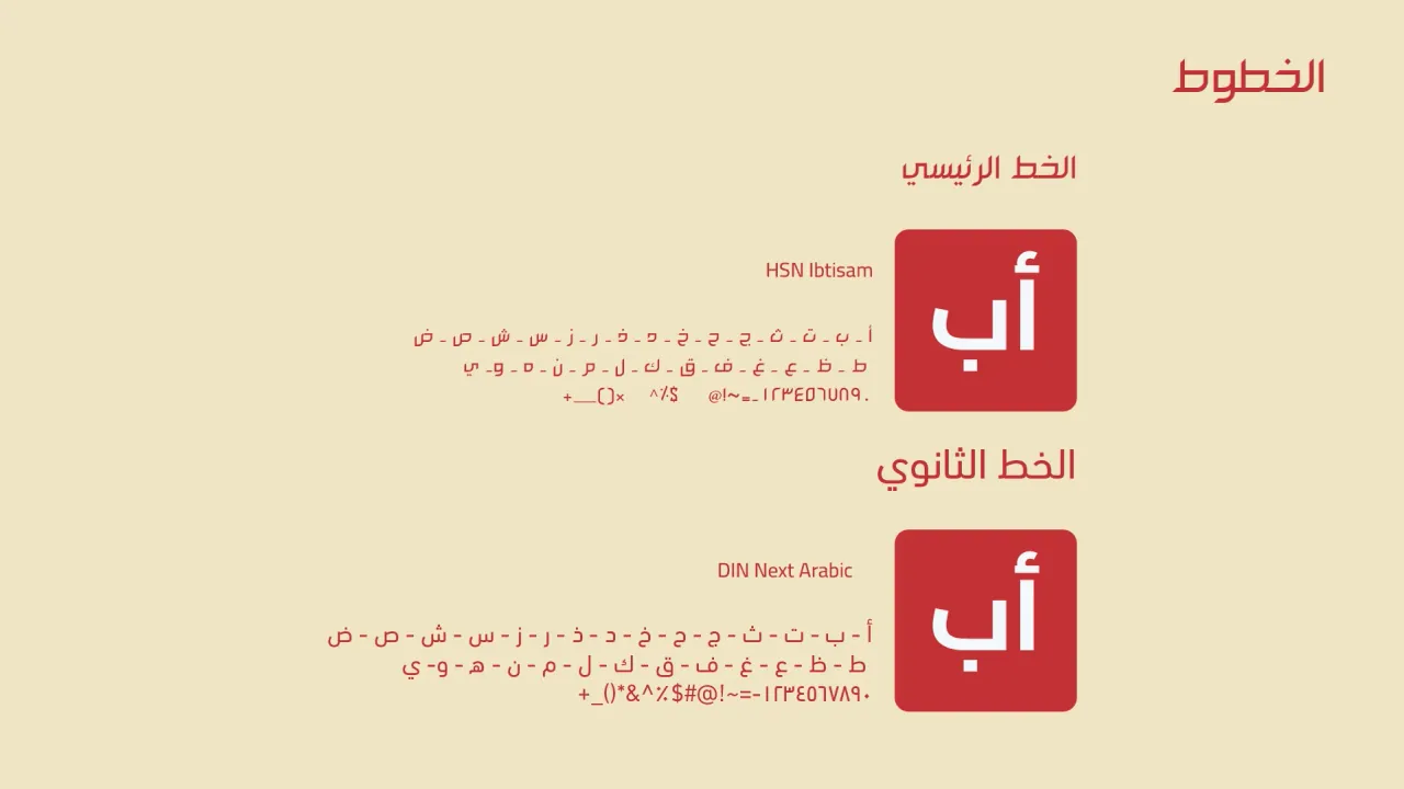
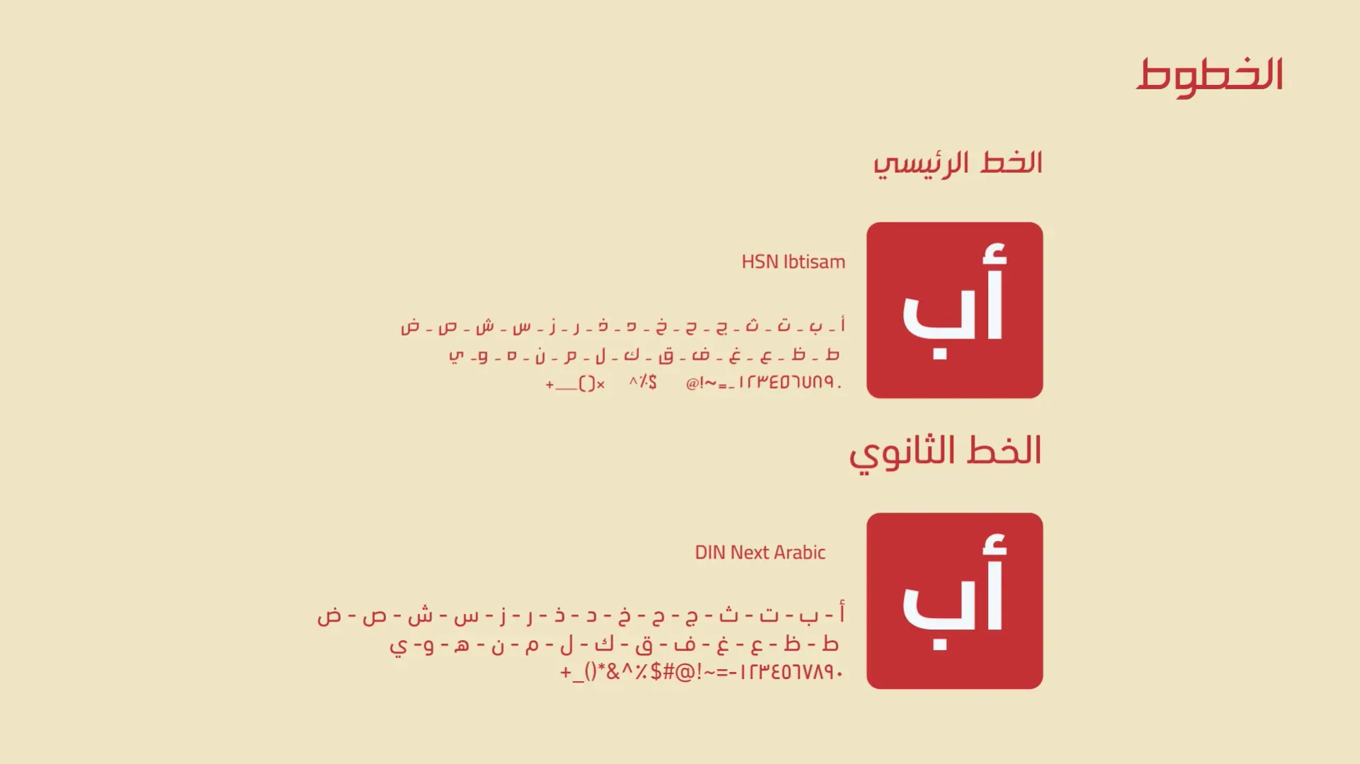
  7. Typefaces: primary and secondary Arabic fonts.
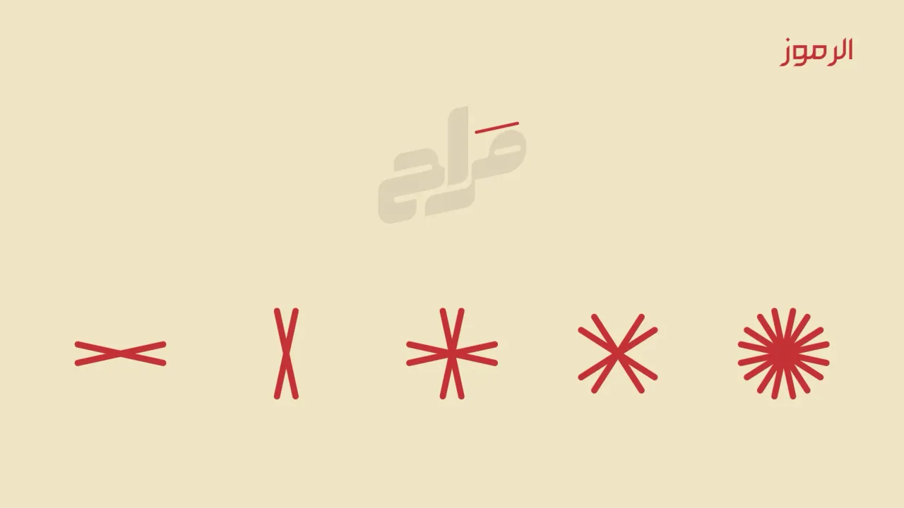
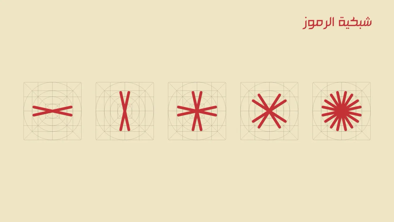
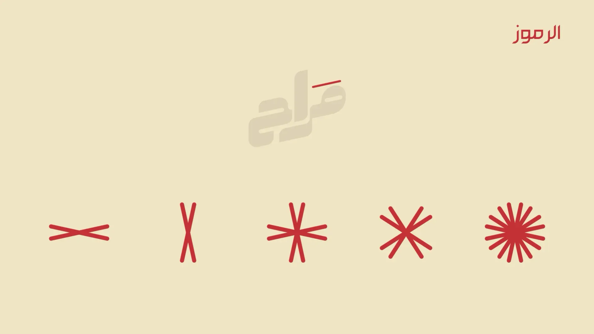
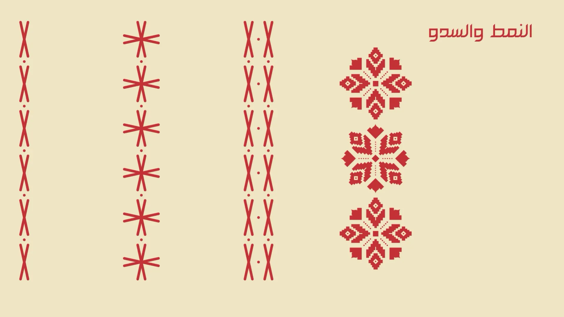
  8. Symbols: a row of red stitch-like marks.
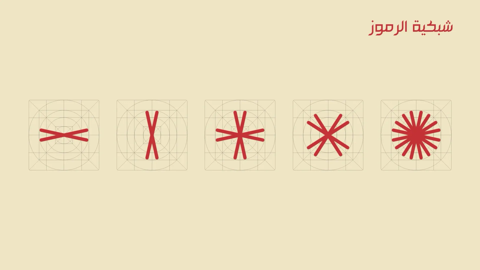
  9. Symbol construction on a grid.
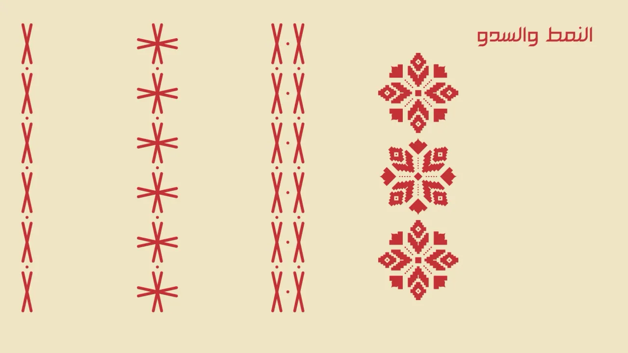
  10. Pattern and texture built from the symbols.
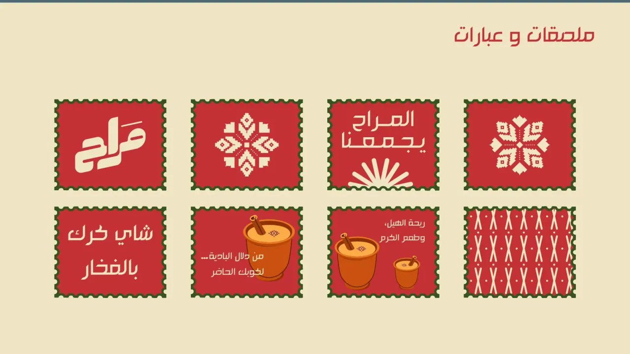
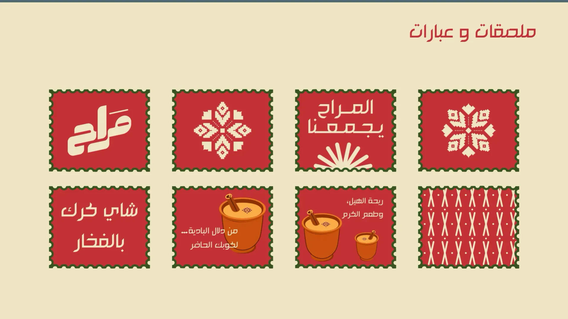
  11. Stickers and phrases: red square stickers with the logo, motifs and Arabic slogans.
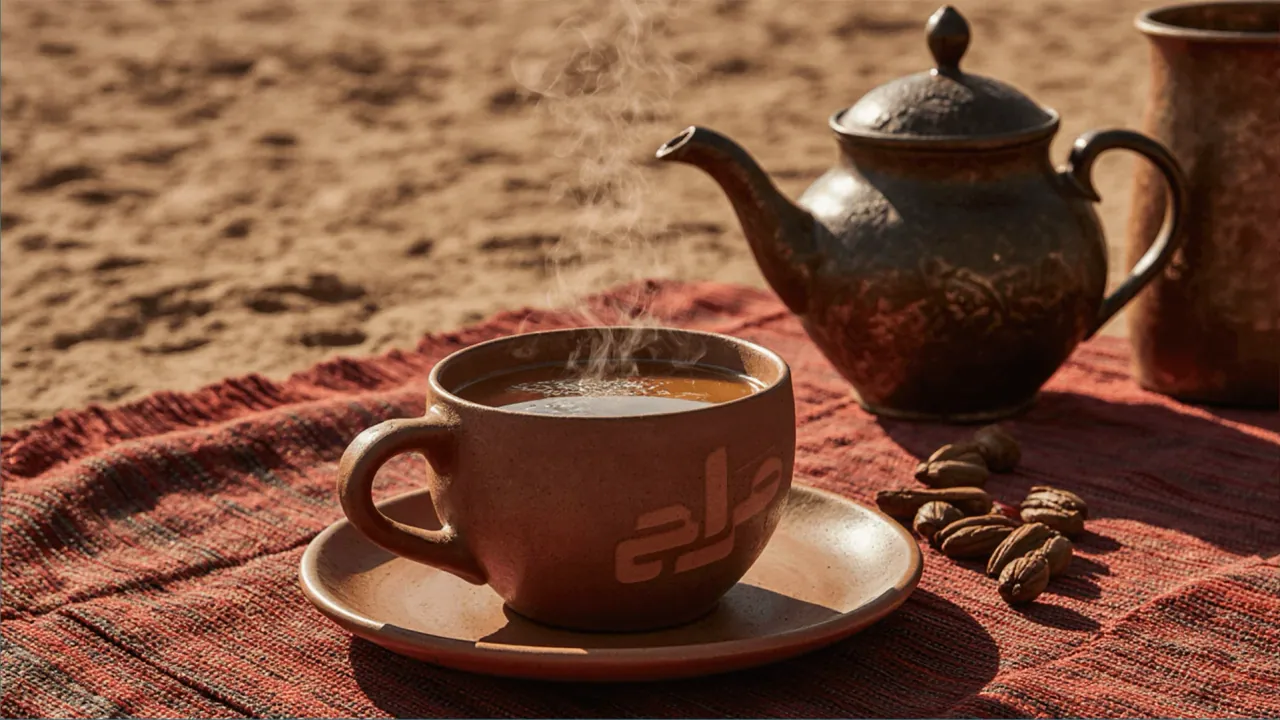
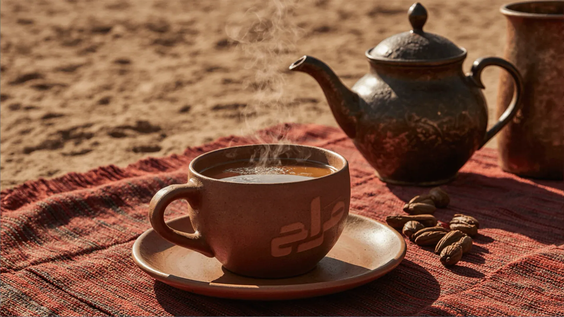
  12. A cup of tea on a red woven rug in the sand, beside a brass teapot and dates.
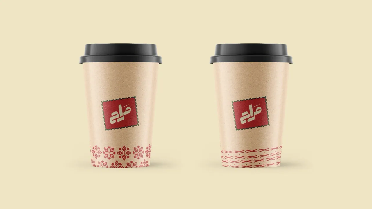
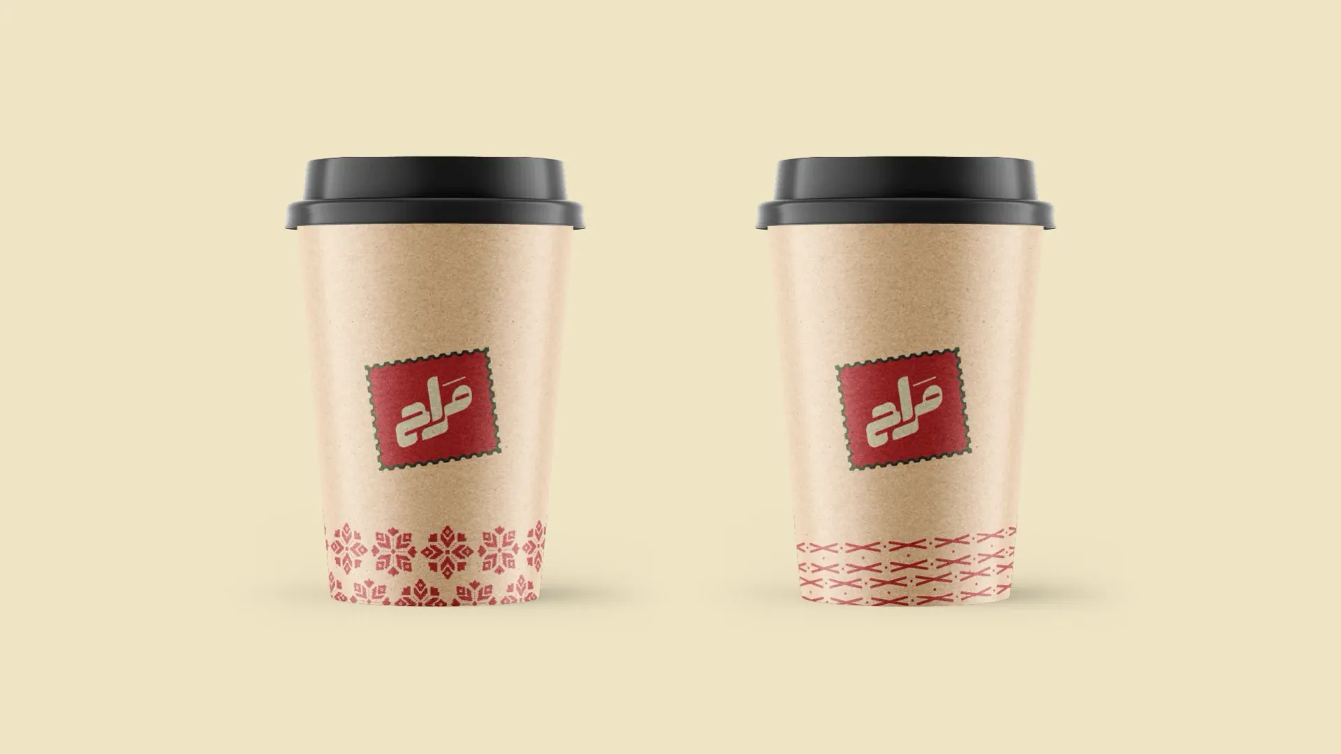
  13. Two cream takeaway cups with a red label and stitched motif.
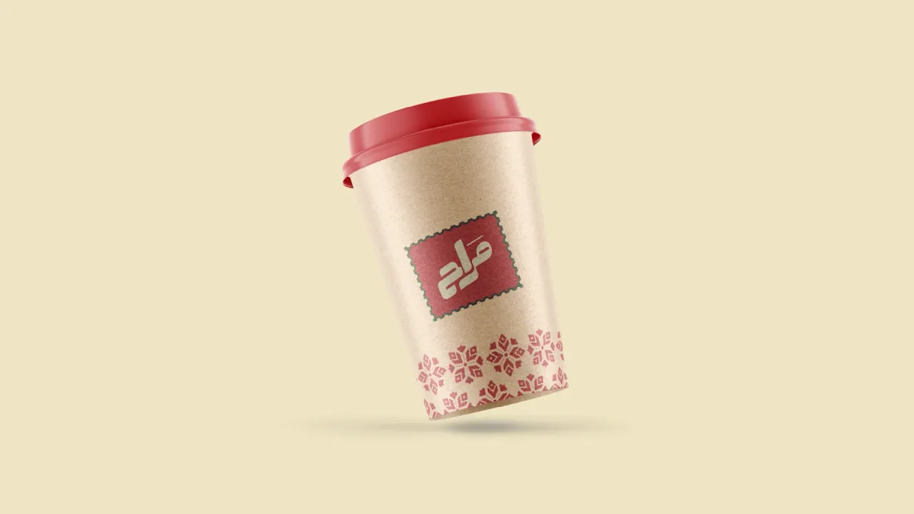
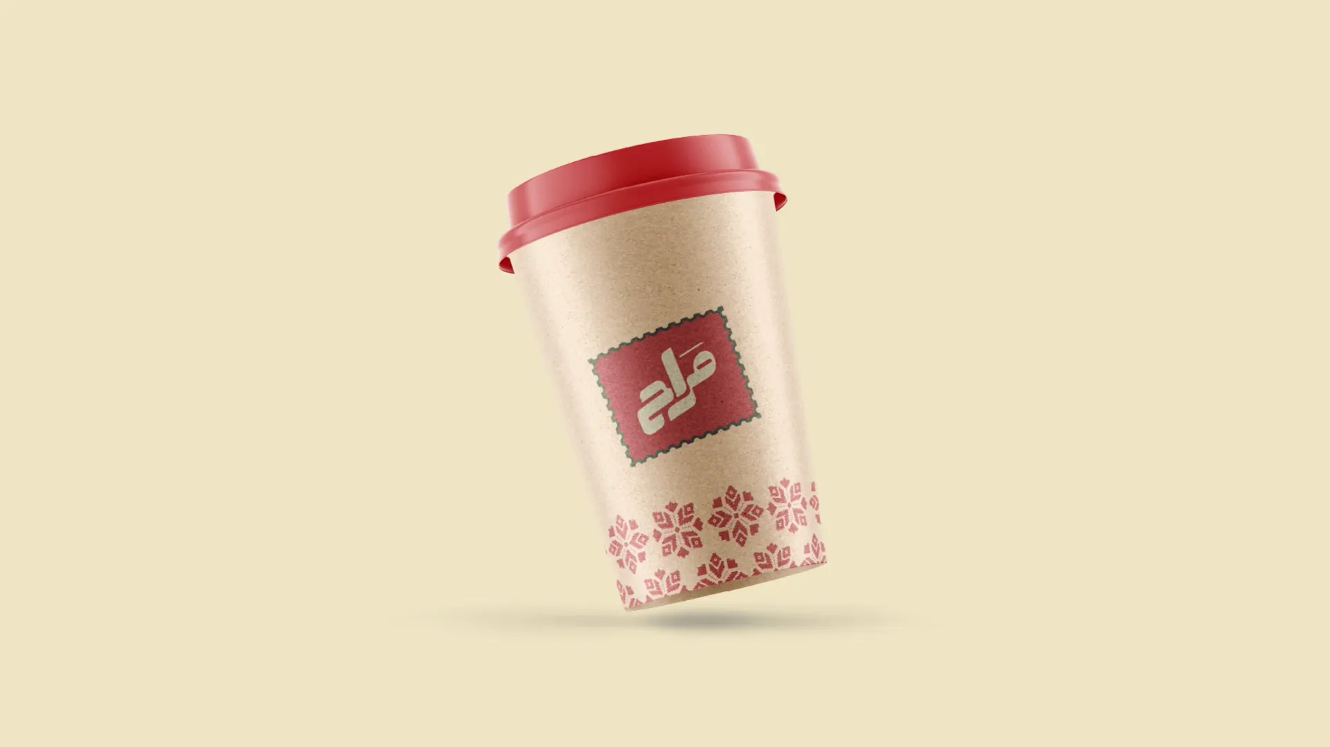
  14. A red and cream takeaway cup.
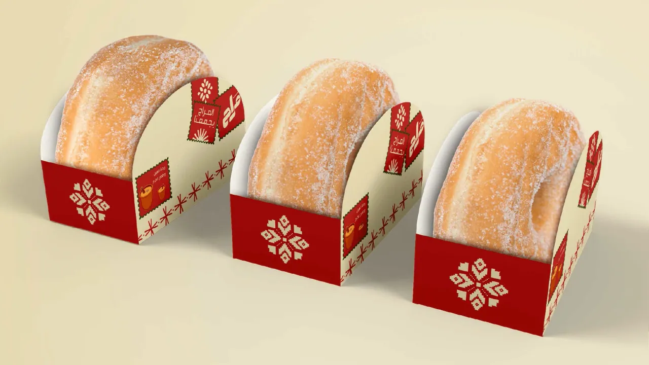
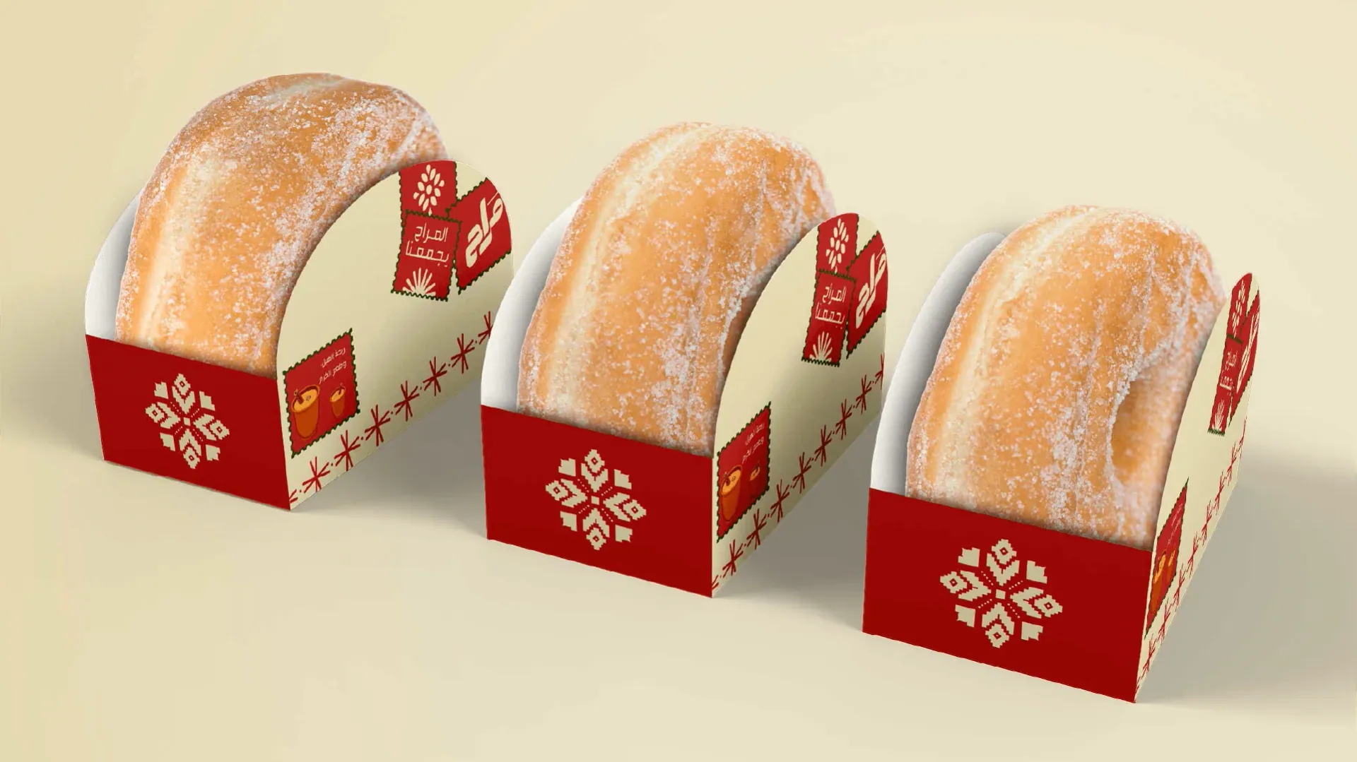
  15. Doughnuts in red sleeves printed with the motif.
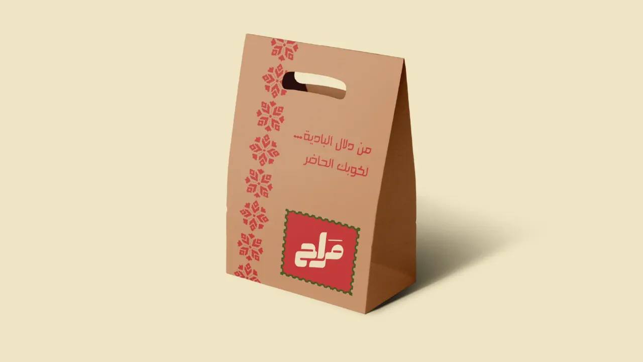
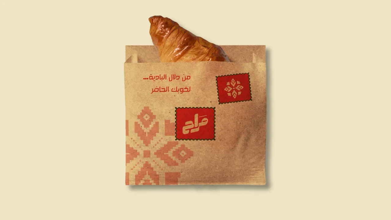
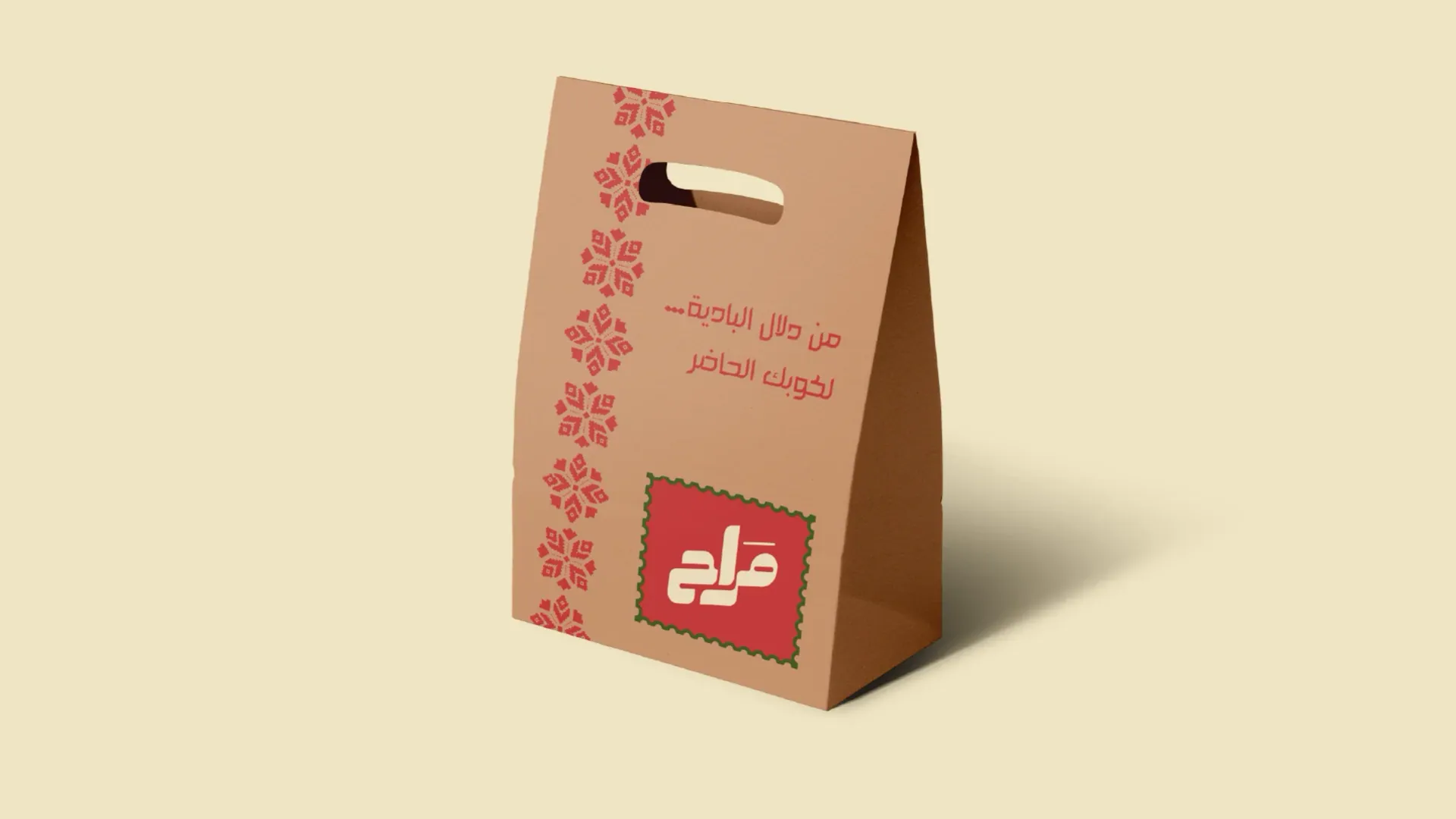
  16. Kraft paper bag with the red logo and motif.
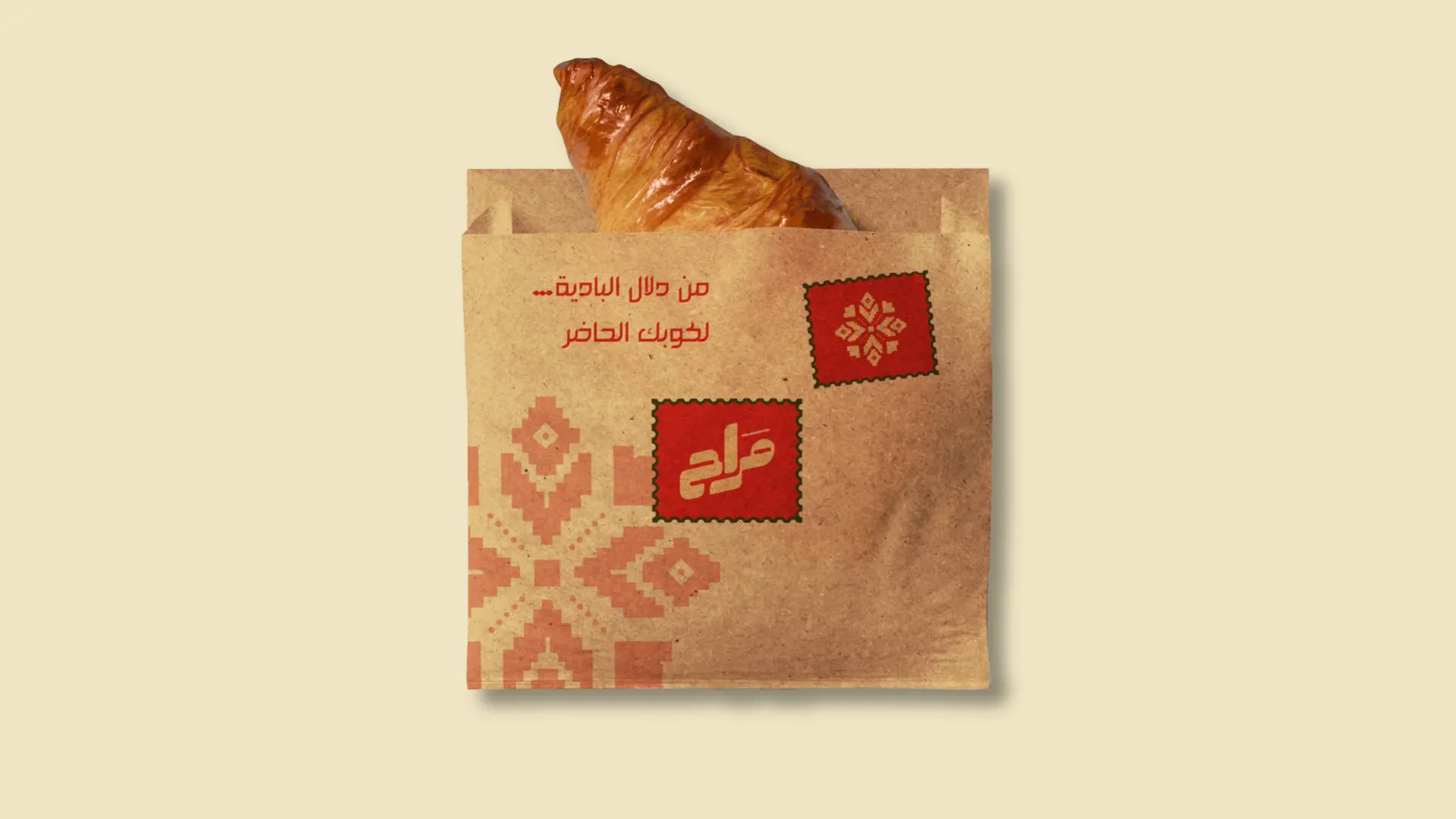
  17. Paper pastry bag holding a croissant.
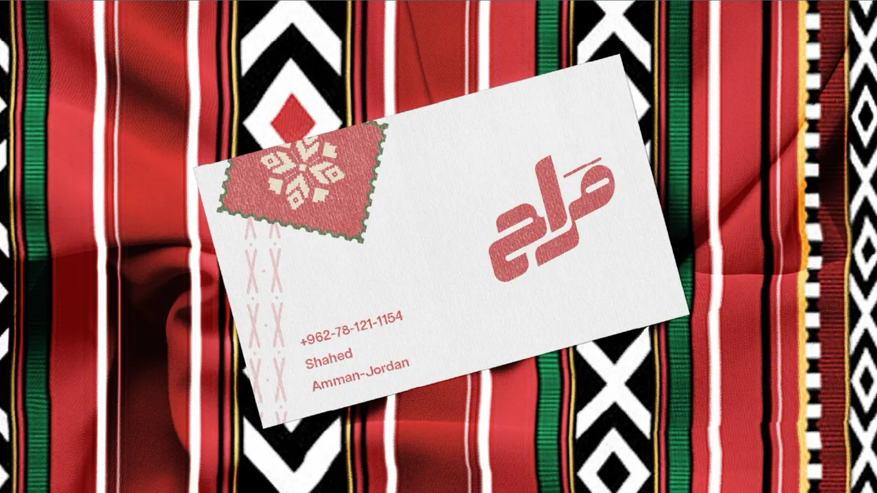
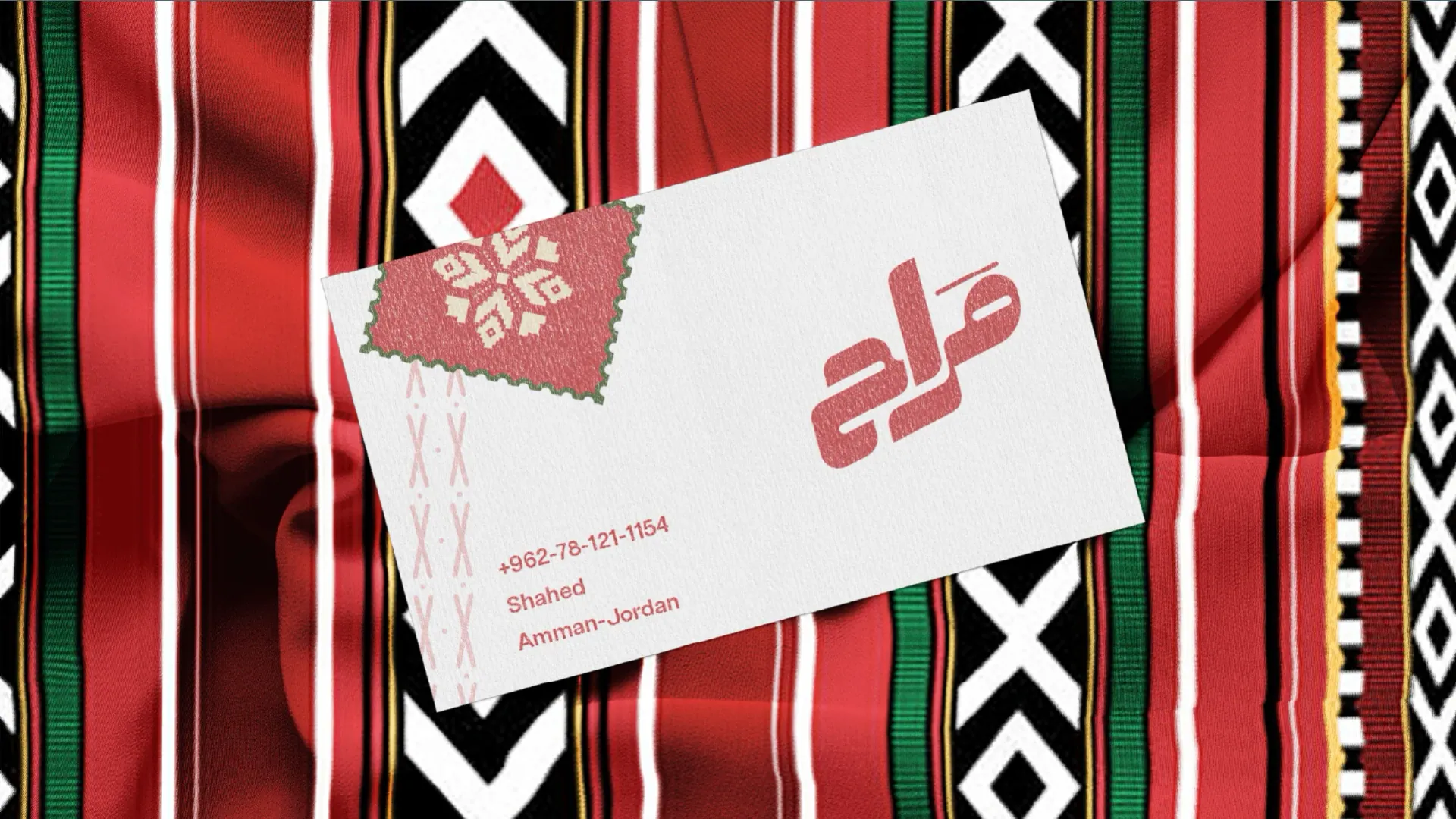
  18. Business card on a red, black and white Sadu-style woven textile.
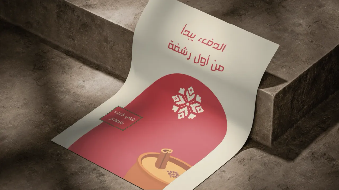
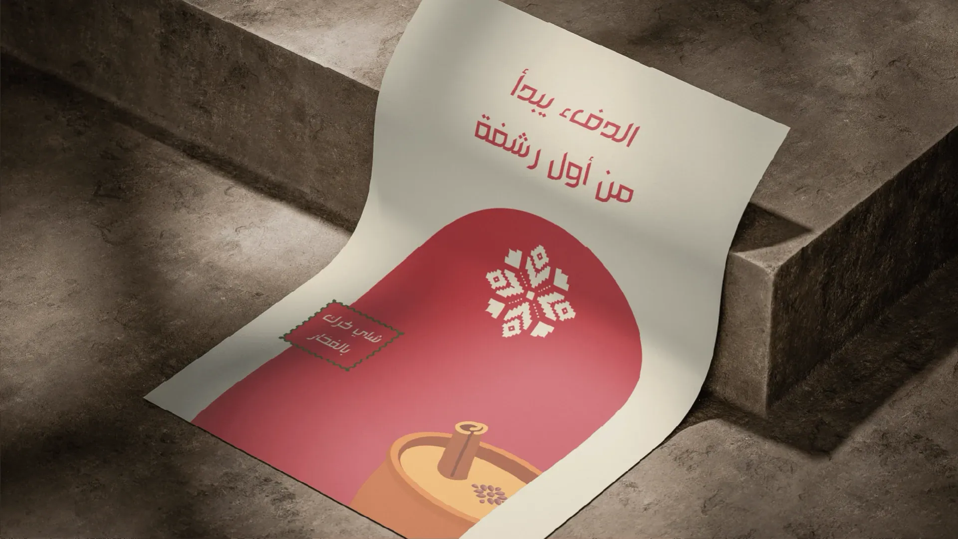
  19. Curling poster with Arabic headline and illustration on stone steps.
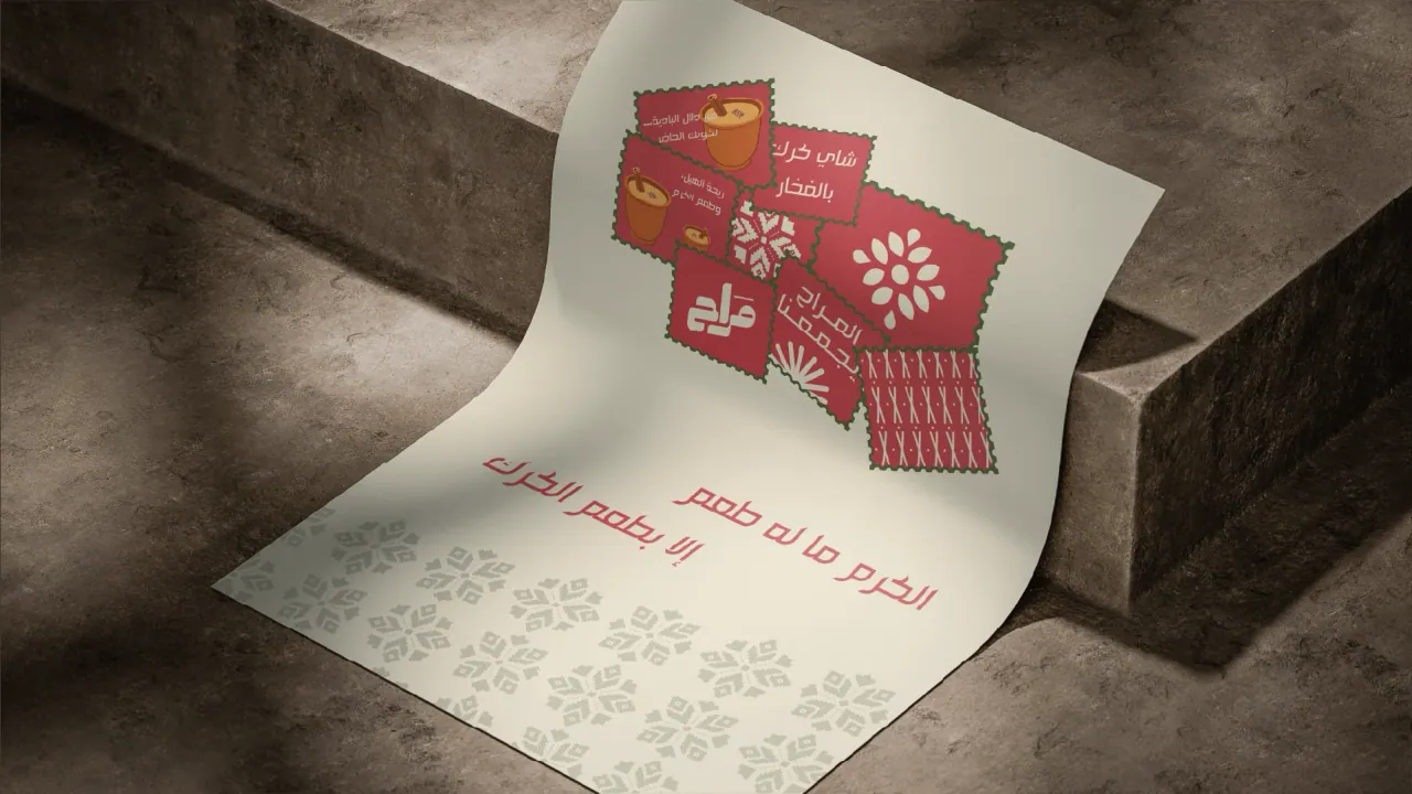
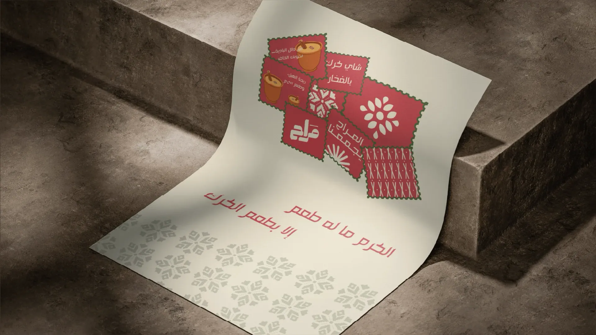
  20. Flyers scattered over cream paper with Arabic text and stickers.